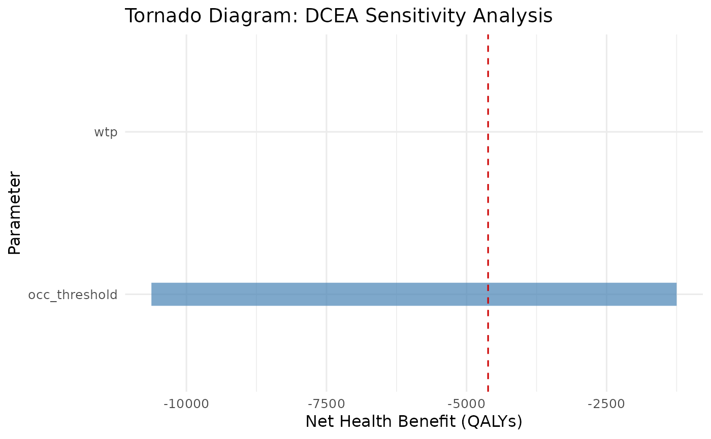
Creates a tornado diagram showing the influence of each parameter on the net health benefit. Parameters are sorted by range (most influential at the top).
Arguments
- sensitivity_result
Output from
run_dcea_sensitivity.
Examples
result <- run_aggregate_dcea(
  icer = 25000, inc_qaly = 0.5, inc_cost = 12500,
  population_size = 10000, wtp = 20000
)
sa <- run_dcea_sensitivity(result)
plot_dcea_tornado(sa)