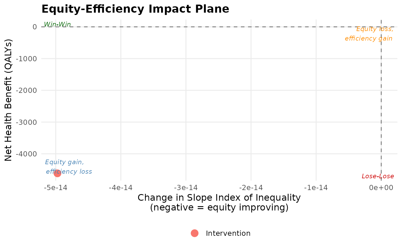
Creates the equity-efficiency impact plane as described in Cookson et al. (2017) Value in Health. The x-axis shows health inequality impact (change in a chosen inequality index), the y-axis shows net health benefit (efficiency). Four quadrants represent: Win-Win (NE), equity gain and efficiency loss (NW), equity loss and efficiency gain (SE), Lose-Lose (SW).
Usage
plot_equity_impact_plane(
  dcea_result,
  comparators = NULL,
  x_axis = "sii_change",
  y_axis = "nhb",
  show_psa_cloud = TRUE,
  show_quadrant_labels = TRUE,
  show_threshold_lines = TRUE,
  point_labels = NULL,
  colour_palette = NULL,
  theme_style = "publication"
)
Arguments
- dcea_result
Object of class
"aggregate_dcea"or"full_dcea".- comparators
Optional list of additional DCEA result objects to overlay on the same plane (for multi-comparator plots).
- x_axis
Inequality metric for x-axis. One of
"sii_change"(default),"atkinson_change","gini_change".- y_axis
Health outcome for y-axis. One of
"nhb"(default),"net_monetary_benefit".- show_psa_cloud
Logical. Show probabilistic scatter cloud if PSA data are available (default:
TRUE).- show_quadrant_labels
Logical (default:
TRUE).- show_threshold_lines
Logical. Show NHB = 0 and inequality = 0 reference lines (default:
TRUE).- point_labels
Optional character vector of labels for points.
- colour_palette
Optional named character vector of hex colours.
- theme_style
Visual theme:
"publication"(default) or"ggplot_default".
References
Cookson R, Asaria M, Ali S, Shaw R, Doran T, Goldblatt P (2017). Health equity monitoring for healthcare quality assurance. Social Science & Medicine 198: 148-156.
Examples
result <- run_aggregate_dcea(
  icer = 25000, inc_qaly = 0.5, inc_cost = 12500,
  population_size = 10000, wtp = 20000
)
plot_equity_impact_plane(result)